On this page
A handwriting grid provides reference lines for placing a character's parts. The most useful sheet is not always the one with the most guides. Choose enough support to practise the feature you are working on, then leave space to write without tracing.
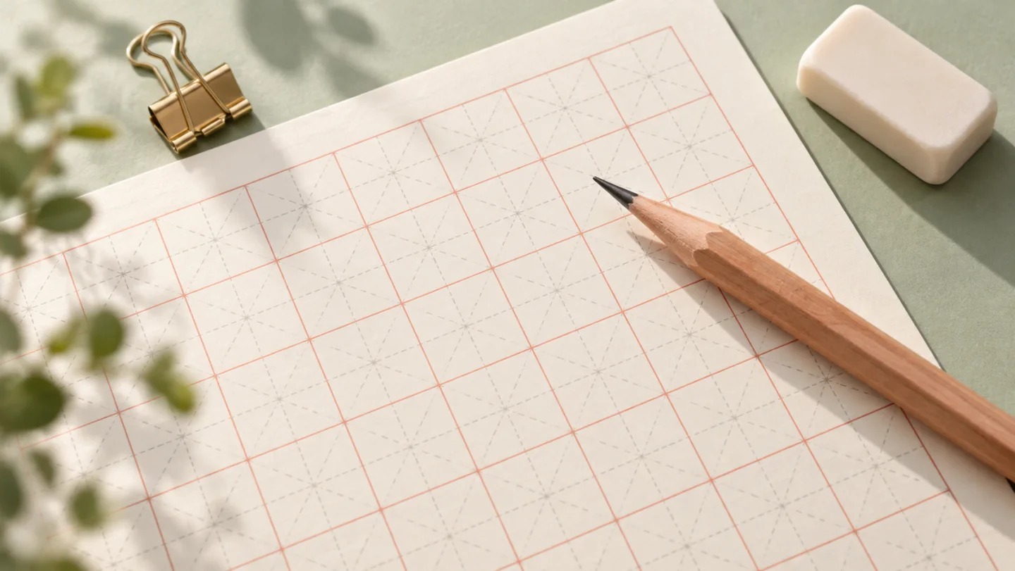
Square grids, 田字格 and 米字格 all keep individual characters within a cell. Their internal lines differ, so they help with slightly different aspects of balance.
Match the grid to the practice
| Grid | Useful reference | Typical practice |
|---|---|---|
| Plain square | Outer boundary | Writing independently and keeping a consistent size |
田字格 | Horizontal and vertical centre lines | Balancing left-right and top-bottom components |
米字格 | Centre lines and diagonals | Comparing stroke angles and positions around the centre |
The lines are guides, not targets that every stroke must touch. A narrow component and a wide component may need different shares of the cell. Filling every character to all four edges can make a page look cramped even when each character stays inside its box.

Start large enough to see the structure
A cell around 20 mm is a practical starting point for trying unfamiliar forms with a pencil. This is a practice choice, not a universal school standard. If the learner needs more room to control the strokes, increase the size; if they can write comfortably and clearly, reduce it gradually.
Choose a small set of characters rather than filling a sheet with unrelated examples. For instance, practise a simple character, a left-right structure and an enclosure. Compare their balance before adding more repetitions.
Combine a model with blank attempts
Trace a clear model briefly, then write the same character in an empty cell without looking at the model for every stroke. Compare the result with the original: centre position, component width, stroke direction and the spaces between strokes.
For a character that looks wrong despite repeated tracing, check its stroke-order animation. Grid lines help position strokes but do not tell you which stroke comes first or where a turning stroke continues without lifting the pen.
Use the guides for a specific comparison
Try 十, 好 and 国 as three contrasting examples. For 十, the centre guides help you compare where the horizontal and vertical strokes cross. For 好, they help you see how the left and right components share the available width. For 国, compare the space around the inner component rather than simply making the outside box large.
These are observation tasks, not rules that every stroke must coincide with a printed line. The model character supplies the form to compare. If a learner moves every vertical stroke onto the cell's centre line, the grid is being treated as a tracing route rather than a reference system.
On a short practice row, keep the same character and grid size so that changes are easy to see. After several attempts, change only one feature, such as the width of a component or the distance between two strokes. Changing the character, pen and cell size together makes it harder to see what helped.
Choose readable models and spacing
Make sure the model is a suitable writing form for the learner's target script. A highly decorative typeface can exaggerate features that are not useful for beginning handwriting. If the model is printed in a pale tracing colour, it should remain visible enough to follow without making the learner's own pencil marks difficult to distinguish.
Optional pinyin can help identify the character, but it also needs its own space. Do not shrink the character until it is hard to inspect merely to fit a long pronunciation annotation into a narrow cell. Check a preview with the actual characters and annotations you intend to print, not just a blank grid.
Leave some blank cells after the models. A sheet on which every cell contains a full tracing outline tests following a line more than independent recall. A mixed row lets the learner move from observation to guided writing and then to an untraced attempt without changing sheets.
For a group lesson, make one sample print with the chosen pen or pencil. Lines that look subtle on a screen may disappear on a printer, while a heavy border can compete with the writing. This is a practical print check rather than a reason to add more decoration. Keep the grid visible and the character itself easy to read.
If the sheet is reused on a tablet instead of paper, treat the displayed size as a separate setup. Zooming changes the apparent cell size even though the document's stated millimetres remain unchanged. Choose a comfortable view and keep it steady during a short comparison exercise.
Check the print scale
- Choose the actual paper size, such as A4 or Letter, in the Chinese practice-sheet generator.
- Preview the generated sheet and check that the characters and optional pinyin fit.
- Match the printer paper setting to the sheet size.
- Use actual size or a known scale when exact cell dimensions matter; automatic fit-to-page can change them.
- Print one page first and measure a cell before printing a class set.
A clean, legible model matters more than a decorative background. Keep a few untraced attempts from the start and end of a practice session so progress can be compared without relying only on how a fully traced sheet looks.
Comments
Loading…
No comments yet.